Baskerville's PREFACE


Baskerville's PREFACE
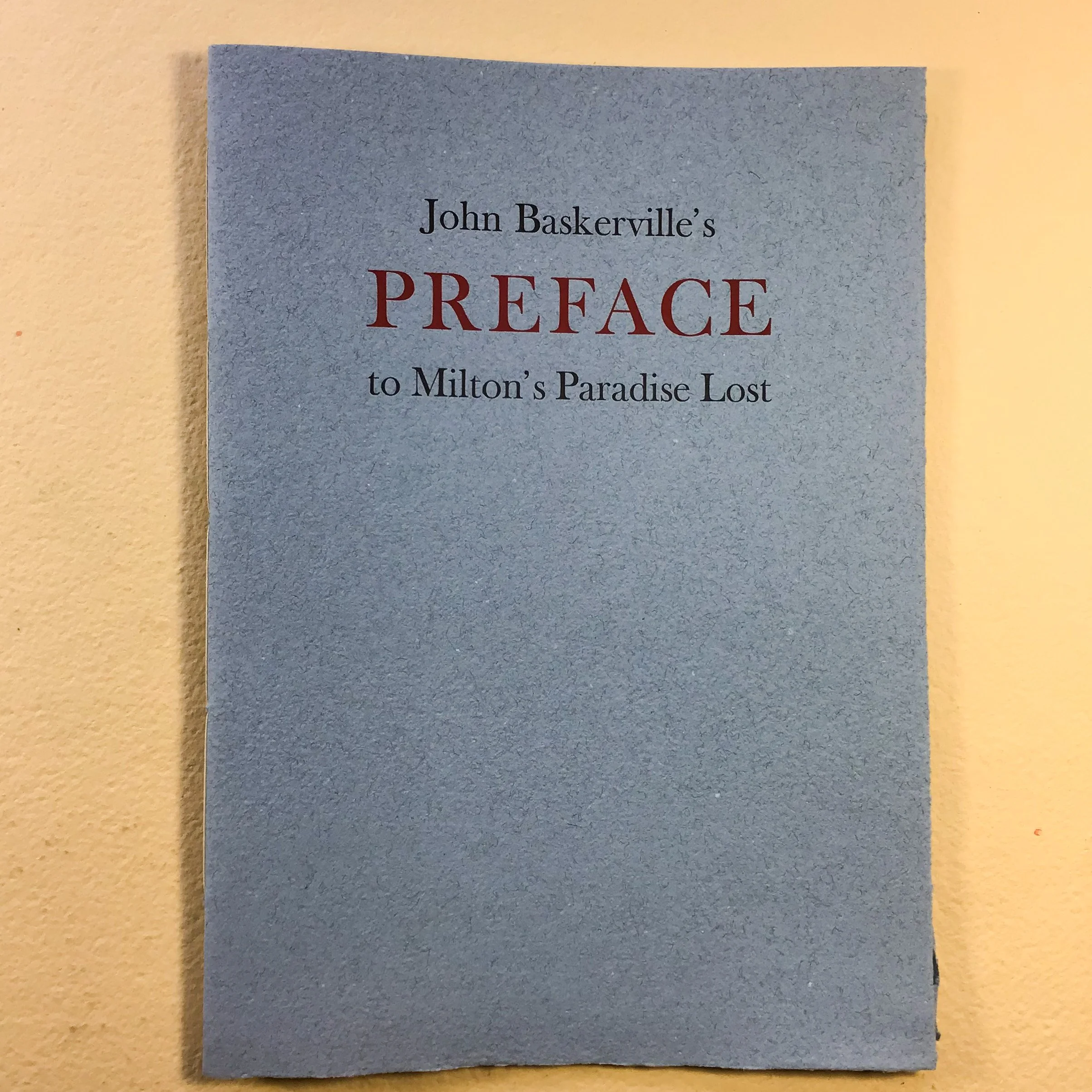
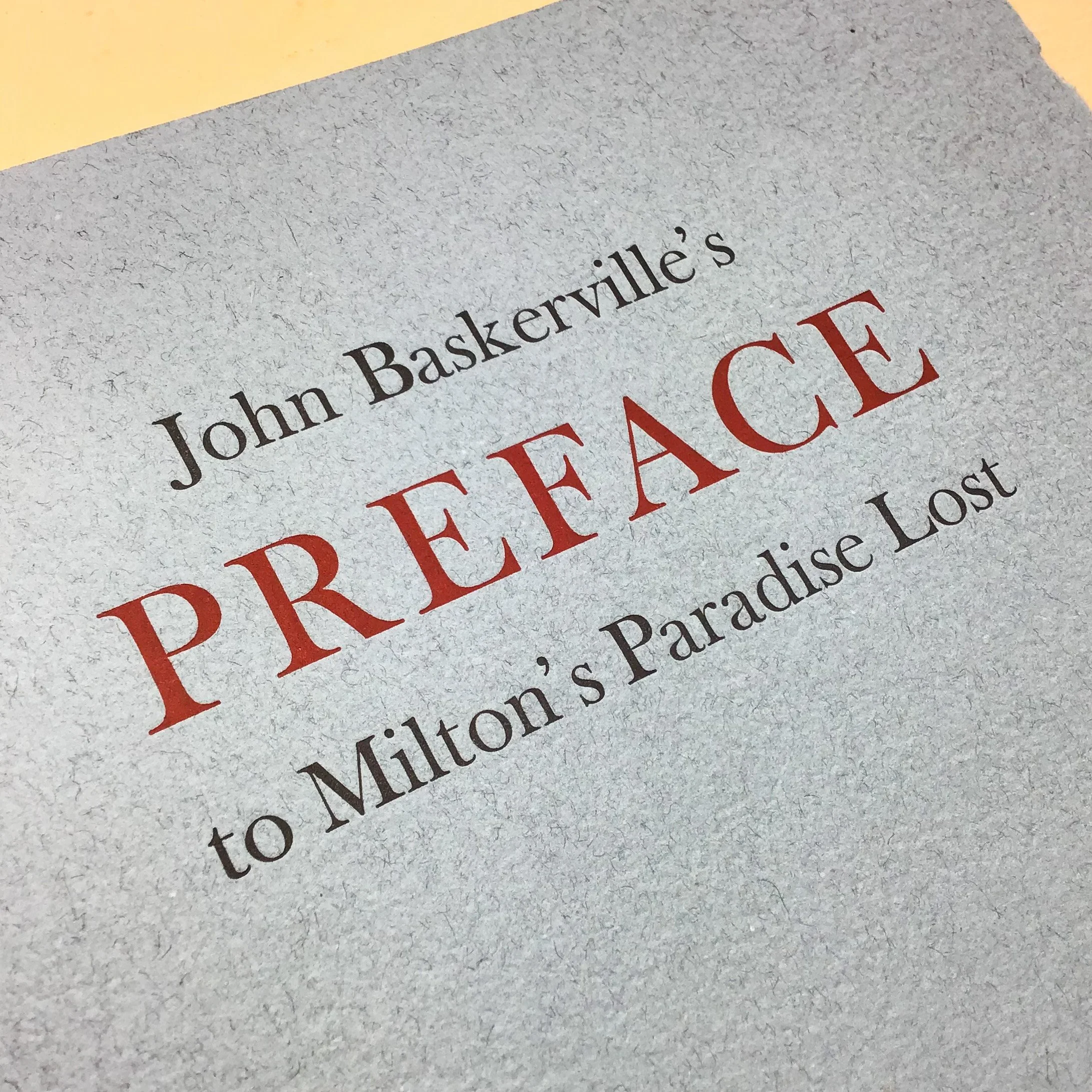
Next year will see the 250th anniversary of the death of John Baskerville. To prepare for that we offer his own explanation of why he became a designer of type, a type founder, a printer and a publisher. He wrote this as the PREFACE to his 1758 edition of Milton’s Paradise Lost; unlike any other, this preface is no introduction to the rest of the books content. He praises Mr Caslon for his typeface; thanks Mr Tonson, the bookseller, for purchasing the entire edition. Otherwise the preface concerns his motivation in his efforts to produce the finest workmanship of paper, types, and ink.
Our edition is introduced by Dr Caroline Archer-Parre, professor of typography at Birmingham City University. The texts are presented as a specimen of three Baskerville types; the Monotype italic, considered by F E Pardoe (John Baskerville, 1975) to be the best of the revivals and based on Baskervilles Great Primer typeface of 1772; the first imitation (1766) by Isaac Moore, usually known as Fry’s Baskerville, which was re-issued by typefounders Stephenson, Blake in 1909; and Alcuin Baskerville, issued by Monotype in 1929 and designed for the Alcuin Press, this casting made for us by the Effra foundry of York, who hold a set of the special matrices.
Printed on Zerkall paper, this is our annual book To Greet The New Year, available as a paperback sewn into heavy hand made cover paper at the Two Rivers Paper Mill of Watchet, (£25) and in a hardback edition bound in Roxburgh style with our own paste paper over boards (£48). Price includes UK postage, overseas postage added at cost.