Designing a uniform series
I remember when Anthony Burgess first caught my attention. What age must I have been? Fourteen or fifteen I should think - everything influential happened around then - and ready dressed to go out for the evening. My parents were watching something on television when his voice caught me, stopped me, turned me round and kept me listening, standing behind the couch, halfway to the door, until the programme had finished. All that cigarette smoke! Then there were the reviews he wrote in the Sunday paper and me scanning the tv guide to see when he would be on again. That was pretty much it. I read some of his novels from the library from the mid-60s onwards, never buying any, missed the film of Clockwork Orange, though I was aware of the furore it caused. I kept a weather-eye out for his work, but there are so many like that, reviewers, writers, personalities in the best sense of the word.
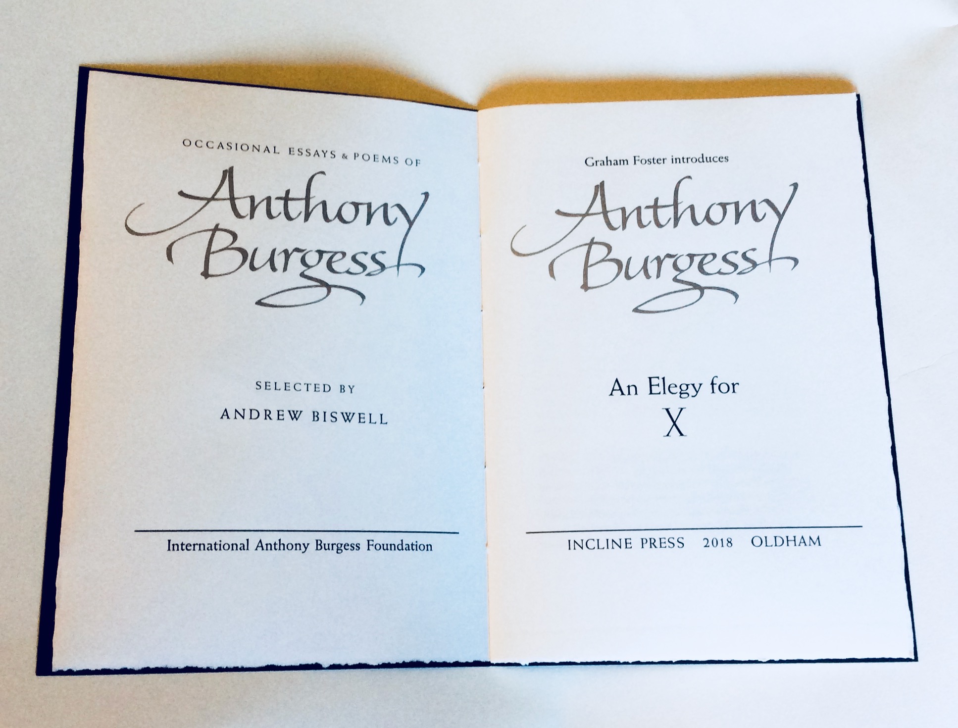
Burgess was a Manchester man, and so we are blessed to have the International Anthony Burgess Foundation in the city for the interesting architecture (Manchester's oldest fireproof mill), the cafe bar and the meeting space as well as for the holdings of Burgess's rich archive. Incline Press have the delightful job over the next few years to publish a uniform series of Burgess material from those archives. Andrew Biswell, director of the foundation and author of The Real Life of Anthony Burgess (Picador paperback, 2006), is responsible for selecting the texts, and then we do the rest. The first is An Elegy for X, to be followed by an unpublished epic, Essay on Censorship, and then four essays around the topic of James Joyce.

I have never designed a uniform series, but I determined from the start of discussions with Andrew Biswell that this was my challenge. The immediate question was simply ‘what makes a series uniform?’, and the answer, as with all questions related to book design, was to trawl the memory. Size of page was an obvious start, and determined nine and a half by six and a half inches would give decent margins and comfortable line length between 26 and 30 ems as the text and type size might demand. And the paper used, (as long as they keep making it!) the amenable Zerkall, which takes printing of illustration and type equally well. I decided on the heavier 170 gram weight which is always handsome in the hand and pleasing to the eye.
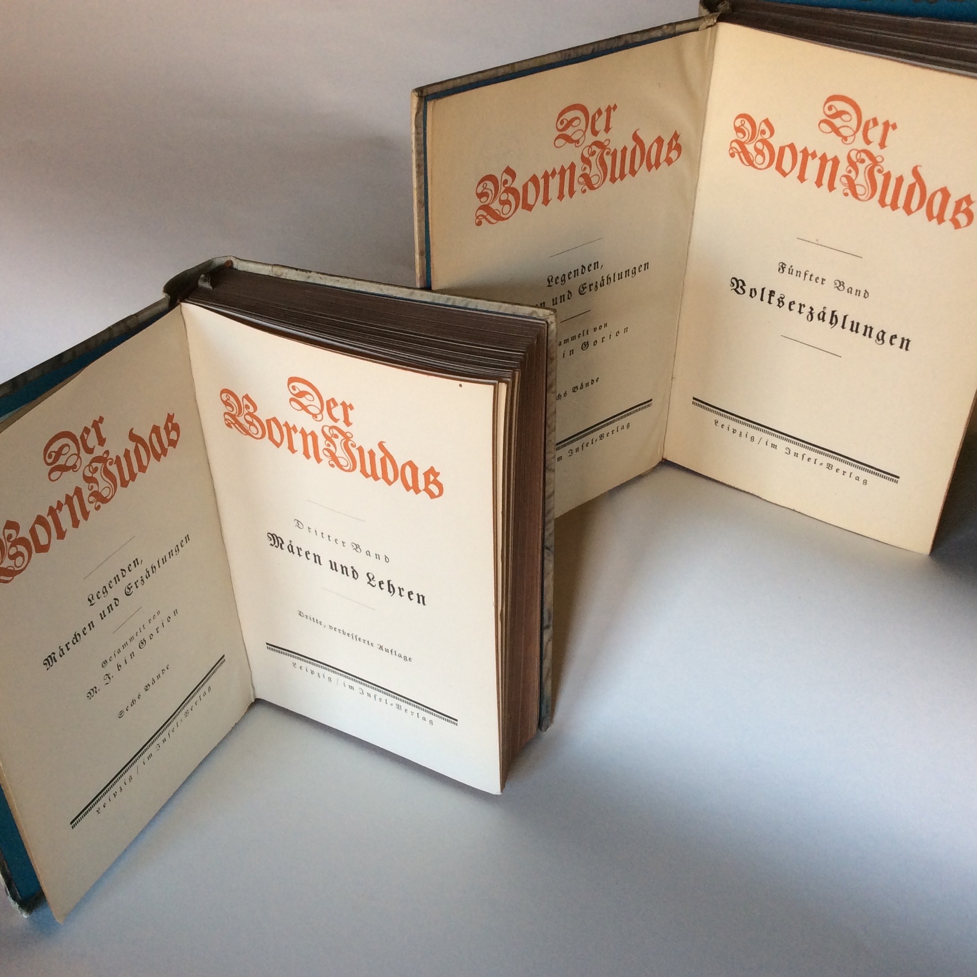
But a uniform series should have some unifying typographic element beyond the size of the page and paper used. What visual connexion should define the different text? Who, I wondered, has done this before? E R Weiss of course, consummate book designer, subject of our book The Typography of an Artist by Jerry Cinamon. This photo shows our inspiration, an elegant set of six volumes, each with an unchanging series title page to the left, and facing that, the title page of each individual volume.

Weiss did his own calligraphy. For our book we were able to call on the skill of Stephen Raw who has created this for us, translated to a magnesium plate for printing. Our series title page will remain in each volume, the title page changing on the right. The colour ink used will be drawn from or reflect the binding. To honour the source of the inspiration, the type used for titling will be Weiss roman, and in this case the X is one of the Weiss Initial Series. That leaves us free to vary the typeface used for the text, and this Elegy is set in Baskerville.
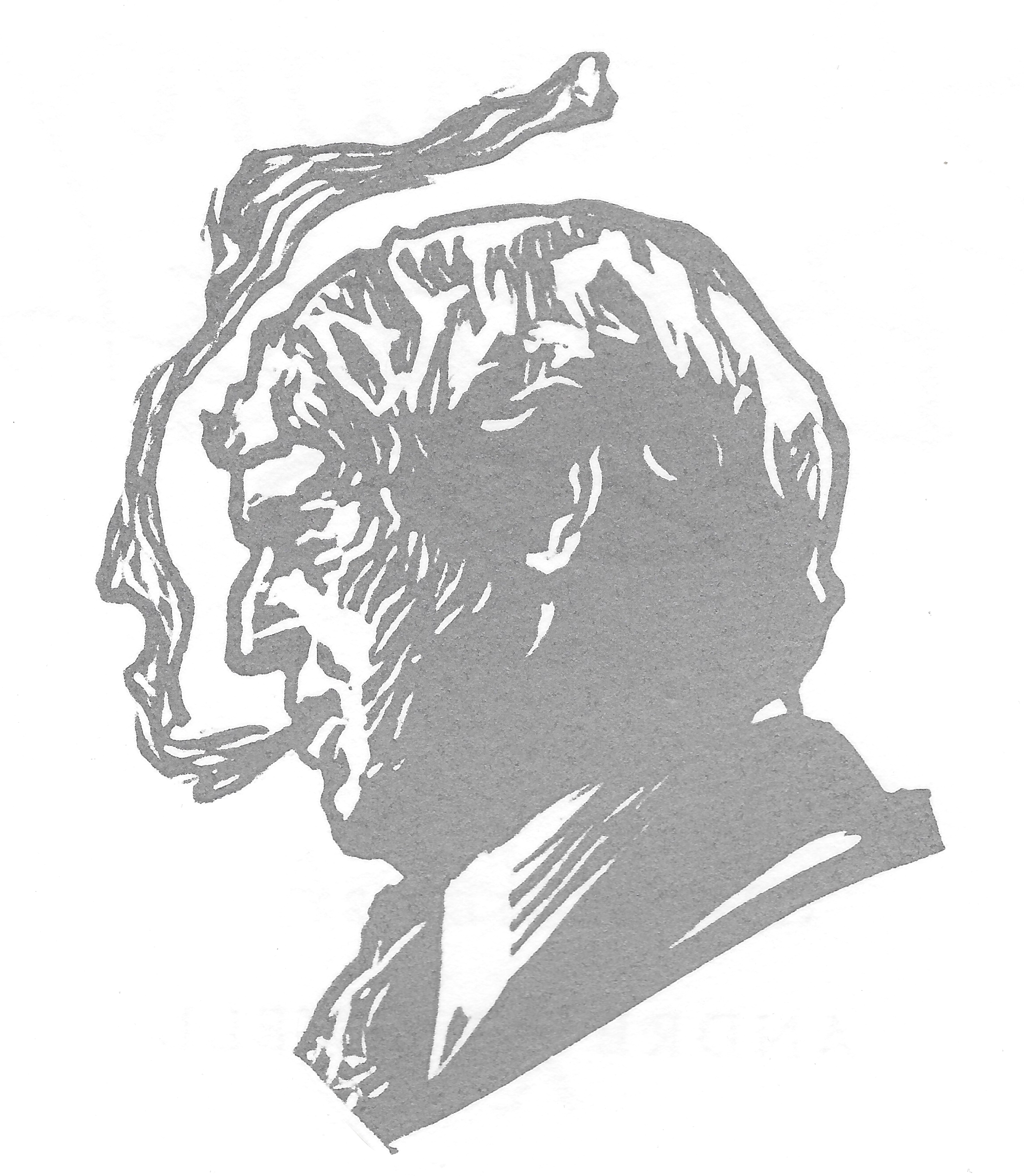
While still considering the series we were sent the final lines of Burgess's Essay on Censorship to print for the hundredth anniversary of his birth, and commissioned Edinburgh printmaker and lecturer John Watson to produce a linocut portrait for the broadsheet. John has a remarkable ability to capture portraits, and this, as you see above, is no exception. It will now serve as a half-title frontispiece for the series, and in this book careful mixing of the silver ink of the front cover title with transparent white and a little black has made it possible to print this showing in what amounts to graphite, though digital photography barely does it justice. Similarly the silver on the front cover and the title page are not shown here in their best light, but the book, the book is fine!