Free Gifts!
Usually when you order from us, you will find in the package things you didn't order. There is a host of reasons for this: I enjoy printing, and creating small display pieces is fun; I can’t abide wasting offcuts of paper; the postal rates are such that there might be weight I can use in addition to that of the ordered item and its packaging; not everything can make a book; small vignettes, isolated cuts like this one, might be interesting in themselves, but also it’s fun to try and find a text to suit them, turning what would otherwise be a decoration into an illustration. And of course, it’s a displacement activity, and sometimes there is a need for that, oddly giving one time to think about unrelated matters.
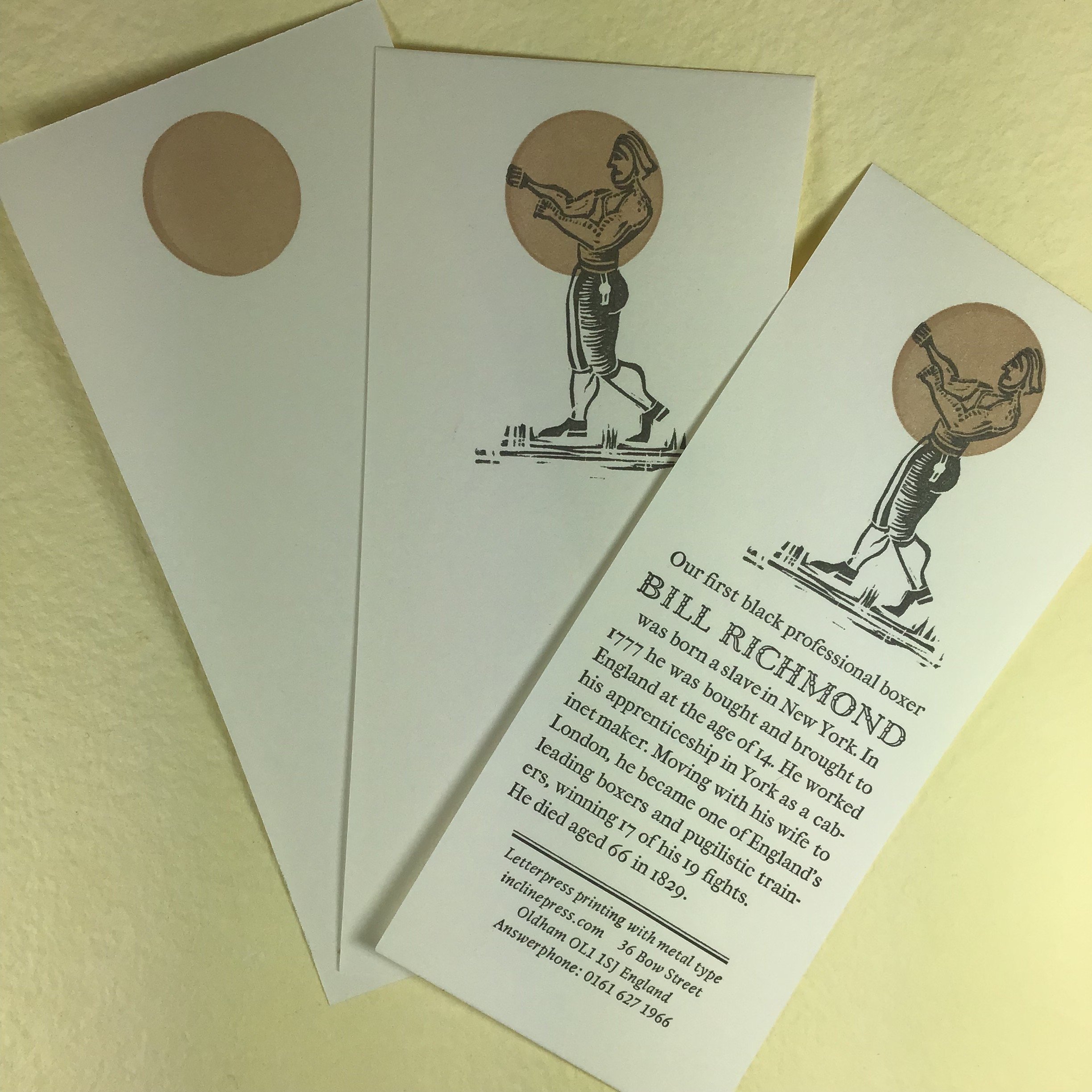
So how did this one come about? Firstly the paper - it’s an offcut from a commercial job, supplied by Justin Knopp at his famed Typoretum.co.uk, and very nice too, perfect for a bookmark. The image is in two parts: the circle printed as a tint, that is a thin colour, mostly transparent medium to carry the pigment, and then the image printed over it in black ink, which maintains its integrity as black because the use of a tint doesn’t interfere with it. Kathy and I found this anonymous linocut for sale at the Oxford Guild of Printers Wayzegoose in November of 2019. It took a while to find a suitable text for it, certainly because no-one was looking for one; there are drawers of small images here, all sitting patiently until a text, or the idea for a text, presents itself. This one took three printings as you see, that is three runs through the press. Firstly the colour, centred towards the top of the sheet, the diameter chosen deliberately to fit the entire torso and no more. Then the image; if you look at the base you can see it is printed to one side, but with the circle it creates a visually centred image. The text had to be printed as a third run because the linocut was mounted higher than the type, thus lifting the inking rollers away so that the type could not print at the same time. Bill Richmond’s name is printed in Dutch Old Style, cast by Theo Rehak at the Dale Guild Foundry in the 1990s, the text is Hungry Dutch, the latest metal type from Monotype, designed by Russell Maret and cast in York by Effra Press. This is our third use of this new type, which I enjoy for its 17th-century quirks, largely to be ironed out of types by Mr Caslon. Finally our address is set in Lectura, a 1950s design by the Dutchman Dick Dooijes. Hungry Dutch only exists in the one size, and a smaller face is needed so that visually the story dominates the piece, so this was the only way to get a size smaller.
And the text: there is a lot more to the story of Bill Richmond than can be fitted onto a bookmark-sized card, and so further research is left to the reader, with a recommendation that you step beyond Wikipedia and find sites with further detail. He was not only Britains first black sports star, but his story nudges against the American Revolution, racism, patronage, and social mobility in Georgian England.