Getting ready for Oxford
Taking marmalade to Oxford would seem a bit like taking coals to Newcastle, but just as Newcastle is no longer a thriving coal port, Oxford Marmalade is no longer made in that city, though the urban archaeologist can easily find the old factory. Oxford for us means the Fine Press Book Fair, on this occasion being held over the weekend of 24th and 25th of March, south of the city centre in the Kassam Stadium.
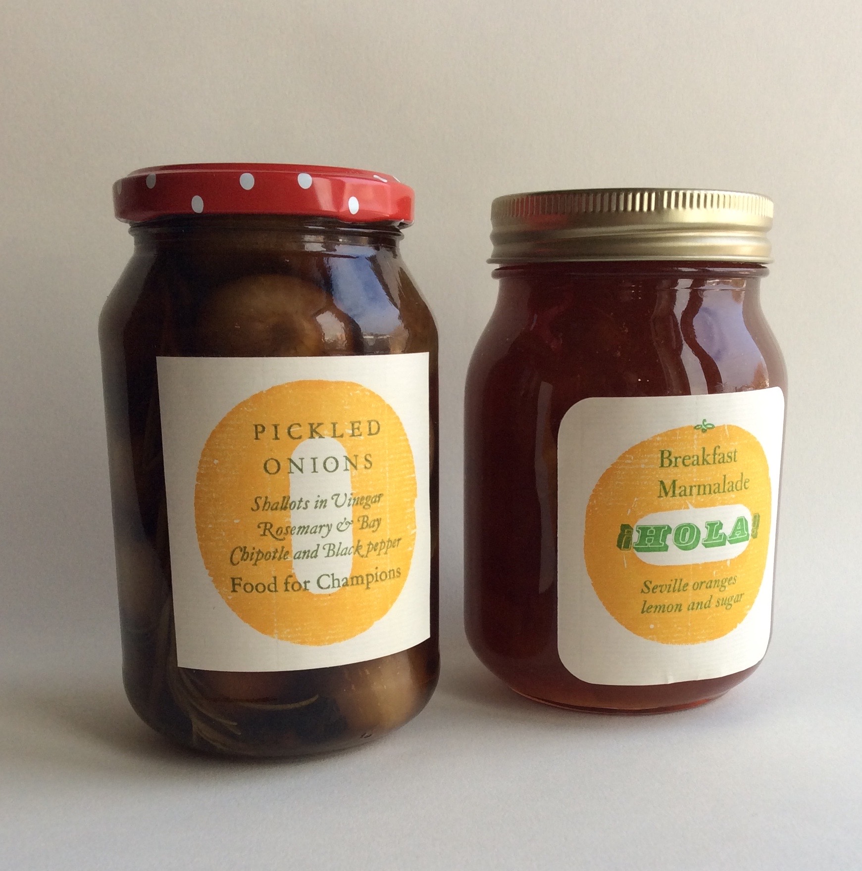
In the past, we have opened our table on the Sunday morning with our jam on display, and though of course, we make the contents, we are really selling the labels in the situation that suits them best: on the jars. They are letterpress printed, of course, a different one designed for each season’s making, and they are as attractive as they are useful.

These two labels both use the same wood letter as the background. Right side up for the onions and turned sideways for the marmalade to exploit the slight dint in the wood. It's an orphan in the printshop - an odd letter without the rest of its fount, and stamped as made by Bonnewell & Co in London, a short-lived maker of wood type for posters. The Pickled Onion label is otherwise set in Monotype Garamond, 14pt roman and 12pt italic, the italic using as many of the swash letters and ligatures as I could get into the text - the ll in Shallots and the Ro of Rosemary are both one piece of metal type, the lower-case k, long C, the V and B are all alternative characters made for this fount. As to ‘Food for Champions': bay leaves are the original laurel from which champions' wreaths were made.


The marmalade label displays three different typefaces: Breakfast Marmalade is Bulmer and the italic is Bell. Both date originally from the late 18th century which is a large part of the reason why they go so well together. HOLA is an odd size of Profil at 22pt, but that is an Anglo-American size imposed on a Spanish-made typeface. There is only one ! in the small fount I have, so the label had to go through the press twice to have the inverted ! added in proper Spanish style, and the residual stem of the 'orange' was added at the same time, nestled in the dint of the wood letter.
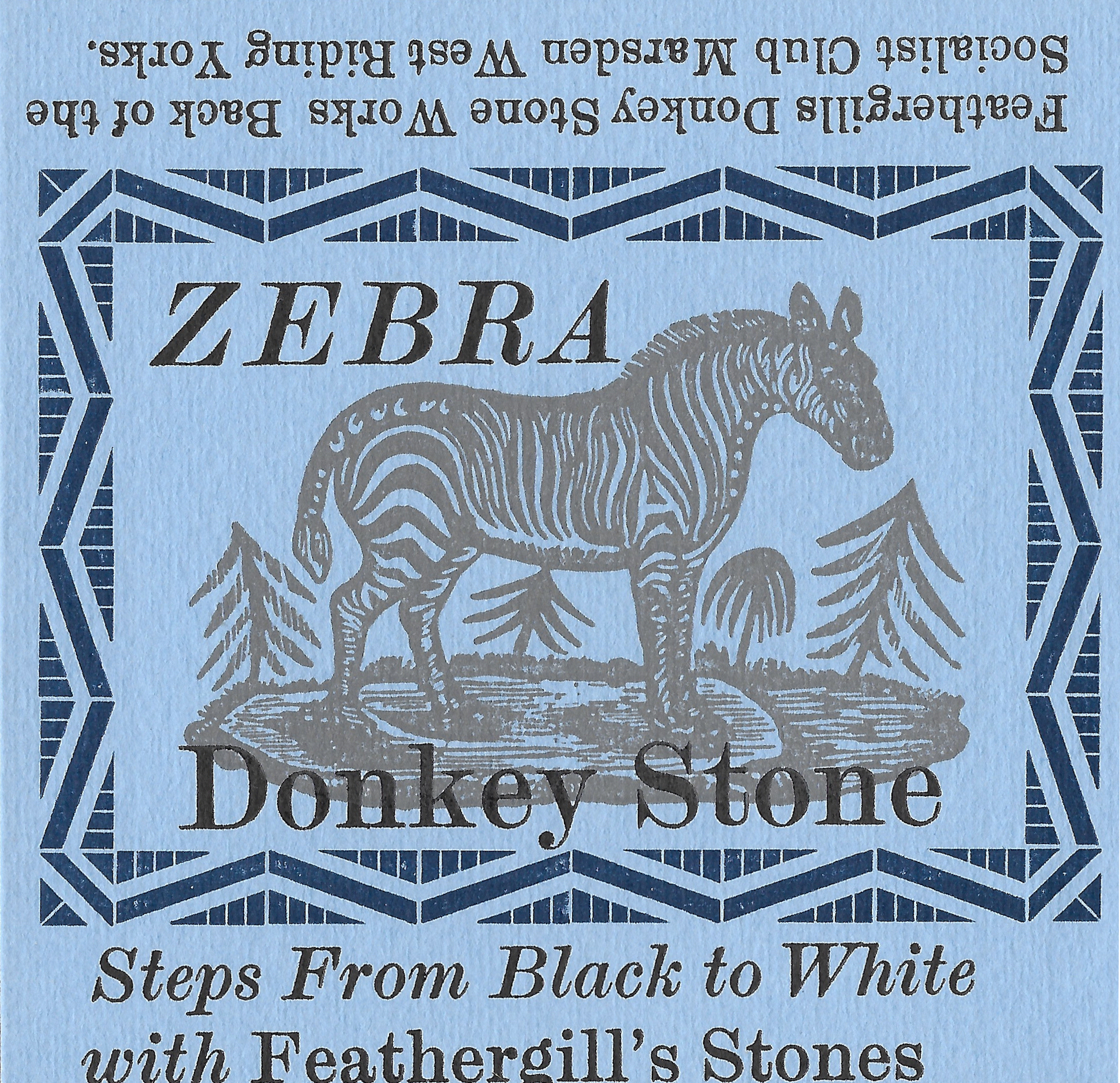
We enjoy the odd bits of ephemera that we make, from these labels to beermats, bookmarks, bills, flyers, stickers, songsheets and occasionally passing sarcasm. Our Subscribers get a copy of everything we print as a benefit of membership, but we tend not to offer ephemera for sale except as part of something else - there are a couple of donkey stone labels in Claire Robertson's Feathergill's Donkey Brand for instance. The last time we published a gathering of our ephemeral work was in 2005 when we issued Hung out to Dry, so we have decided it’s about time to do it again. A pair of volumes discussing the typography of our ephemera in detail is planned for 2019. As a taster, a small sample of recent ephemera, without commentary, will be collected in a portfolio and offered for sale at the Oxford Fair. More details of that will be posted in the next few weeks.